Color makes all the difference
When it comes to designing a website, one of the most important aspects to consider is the color palette. The colors you choose have a significant impact on how users perceive and interact with your website. Colors evoke emotions, convey messages, and create visual harmony. Therefore, selecting the right color palette is crucial to create a visually appealing and effective website design.
In this blog post, we will explore the art and science behind choosing the right color palette for your website. We will discuss the psychology of colors, the principles of color harmony, and practical tips for selecting colors that align with your brand identity and resonate with your target audience. Whether you are designing a new website or considering a revamp of your existing one, this guide will help you make informed decisions when it comes to colors.
Understanding color palette psychology

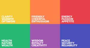
Colors have the power to evoke emotions and influence how people perceive your website. It’s important to understand color psychology and the associations different colors have. Here are some common color associations:
- Red: It symbolizes passion, energy, and urgency. Use it to grab attention or create a sense of excitement.
- Blue: It represents trust, calmness, and professionalism. It is often used by businesses to establish reliability.
- Yellow: It conveys optimism, happiness, and creativity. Use it to add a cheerful touch to your website.
- Green: It symbolizes growth, nature, and harmony. It is commonly used by eco-friendly and health-related brands.
- Purple: It signifies luxury, creativity, and spirituality. It can add a sense of elegance to your website.
- Orange: It represents enthusiasm, warmth, and friendliness. It can be used to create a playful and energetic vibe.
Principles of Color Harmony
Color harmony refers to the pleasing arrangement of colors in a design. Understanding color harmonies can help you create visually appealing and balanced websites. Some popular color schemes include:
- Monochromatic: Using variations of a single color to create a subtle and cohesive look.
- Complementary: Pairing colors that are opposite each other on the color wheel to create a vibrant and high-contrast effect.
- Analogous: Using colors that are adjacent to each other on the color wheel to create a harmonious and cohesive palette.
- Triadic: Selecting three colors that are evenly spaced on the color wheel to create a visually striking and balanced combination.
Establishing Brand Identity Through Colors

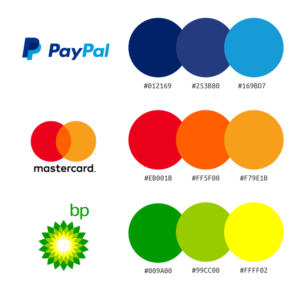
Your website’s color palette should align with your brand identity and convey the right message to your target audience. Consider the values, personality, and target market of your brand when selecting colors. For example, if your brand is focused on eco-friendly products, using earthy tones like greens and browns can reinforce that message. Take inspiration from successful brands!
Accessibility and Color Contrast
While aesthetics play a vital role in color selection, it’s equally important to ensure that your website is accessible to all users, including those with visual impairments. Color contrast is crucial for readability and usability. Low contrast between text and background colors can make it difficult for users with visual impairments to read the content. To ensure accessibility, follow the Web Content Accessibility Guidelines (WCAG) and aim for a contrast ratio of at least 4.5:1 for normal text and 3:1 for large text.
Color Selection for Different Website Elements
Different elements of your website require careful consideration when it comes to color selection. Let’s explore some key elements:
- Header and Navigation Colors: The header and navigation sections of your website should be visually appealing and easy to navigate. Consider using colors that are consistent with your brand identity while ensuring sufficient contrast between text and background colors for readability.
- Background and Content Colors: The background and content colors form the foundation of your website. They should provide a pleasant visual experience and make the content easy to read. Use neutral or light colors for backgrounds, allowing the content to stand out.
- Call-to-Action Buttons and Links: Colors play a crucial role in guiding users to take action. Use contrasting colors for call-to-action buttons and links to make them noticeable and encourage user interaction. High-contrast colors can draw attention and improve click-through rates.
- Text and Typography Color Considerations: Text color is essential for readability. Opt for high-contrast combinations between the text and background to ensure that the content is easily legible. Dark text on a light background or vice versa is a popular choice.
- Use Color to Highlight Important Elements: Use colors strategically to highlight specific elements on your website. For example, use a different color for a promotional banner or a limited-time offer to make it stand out. This draws users’ attention and encourages engagement.
Testing and Iterating the Color Palette
Designing a successful color palette for your website often requires testing and iteration. User feedback and A/B testing can provide valuable insights into the effectiveness of different color choices. Analyze user behavior, conversion rates, and user feedback to fine-tune your color palette and optimize user experience.
Implementing and Maintaining the Color Palette
After you chose your color palette, it’s essential to implement it consistently across your website. Translate the colors into CSS or design elements, and document the color codes and usage guidelines for reference. Regularly review and update the color palette as needed to keep your website fresh and aligned with your brand.
Choosing the right color palette for your website is a crucial step in creating a visually appealing and effective design. By understanding color psychology, principles of color harmony, and considering your brand identity and target audience, you can create a captivating and engaging website. Remember to prioritize accessibility, test and iterate your color choices, and maintain consistency in implementation. With a well-thought-out color palette, your website will leave a lasting impression on users and effectively convey your message. So, go ahead, unleash your creativity, and choose colors that truly represent your brand!


